Decoding Rowing Force Curves: Optimal Power Application Guide
By Priya Nair • 2nd Jan

If you've ever stared at a jagged graph on your rower's monitor wondering why your splits aren't improving, rowing force curve analysis holds the answer. This rowing biomechanics guide cuts through the marketing fluff to show how force curves translate raw effort into boat speed (or lack thereof). Forget vague 'perfect stroke' claims; we're dissecting the physics of power transfer with measurable stroke efficiency metrics. And whether you're troubleshooting noise complaints from downstairs neighbors or syncing data to your Apple Watch, understanding these curves keeps your data under your control.
Open beats closed when your data fuels long-term habits.
Why Your Force Curve Matters More Than Raw Power
Q: What exactly is a force curve, and why should I care? A force curve plots the magnitude of force (vertical axis) against stroke phase (horizontal axis) for every stroke. It's not about peak power, it's about optimal rowing power application across the entire drive phase. Think of it as a fingerprint of your technique:
- Vertical axis: Instantaneous force (in Newtons or arbitrary units depending on monitor)
- Horizontal axis: Position from catch (0%) to finish (100%)
- Area under curve: Total impulse (F × t), directly tied to momentum transfer (M × V). This is the gold standard.
Most rowers fixate on peak force (the curve's highest point), but biomechanics research confirms larger area = more efficient momentum transfer. A 2024 British Rowing telemetry study showed rowers with 15% greater area under their curves achieved 8% faster 500m splits at identical heart rates (proof that force distribution trumps brute strength). For turning these insights into training targets, see our rowing metrics guide.
Reading Your Curve: Shapes, Flaws, and Fixes
Q: What does an ideal force curve look like, and what common mistakes appear?
| Curve Shape | What It Reveals | Impact on Efficiency | Technical Fix |
|---|---|---|---|
| Full Bell Curve | Smooth force application peak at 30-40% | ✅ Optimal | Maintain leg drive through mid-drive |
| Double Diamond | Excessive catch force (spike at 0-10%) | ❌ High energy leak | Delay force application until legs drive |
| Flat Top | Sustained peak force (30-70% plateau) | ✅ High efficiency | Prioritize consistent handle pressure |
| Narrow Peak | Late force application (spike at 50%+) | ❌ Reduced propulsion | Initiate drive with legs before back |
Critical insight: That "smooth bell curve" idealized in apps? It's biomechanically impossible on air rowers (like the ubiquitous Concept2) due to flywheel acceleration physics. What you actually need is a trapezoidal curve (moderate catch force, strong mid-drive plateau, controlled finish release). Water rowers (e.g., WaterRower) more closely mimic boat dynamics, yielding naturally rounded curves. Magnetic rowers? Their curve shape depends entirely on firmware calibration, and here's where open protocols matter.
When Data Sync Breaks Your Technique Analysis
Q: Why do my force curves look different across apps, and how do I trust them?
This is where proprietary ecosystems sabotage your progress. I learned this the hard way when a firmware update (v2.8.1) broke my training app's ANT+ sync mid-interval. My data fragmented across three platforms, making force curve comparisons useless. Without open protocols like Bluetooth FTMS (Fitness Machine Service), you're at the mercy of: For a deeper look at monitor accuracy and data integrity, see our PM5 vs iFIT comparison.
- Vendor-specific smoothing: Some apps artificially round curves to look ideal (e.g., Hydrow's "performance index")
- Sample rate gaps: Low-end rowers report force data at 10Hz vs. Concept2's 60Hz, critical for catching double-diamond spikes
- Sync desyncs: Missing 5-10% of stroke data (common in congested Bluetooth environments) distorts area calculations

Do this: Export raw CSV data via ANT+ or FTMS (check firmware v3.0+ compatibility). Compare curves in open tools like GoldenCheetah or Evenly using raw timestamped data. A 2025 erg research paper found 68% of "smooth" app curves hid irregularities visible only in unsampled data. Until vendors adopt open telemetry standards (like ErgData's API), assume all in-app analytics are smoothed for marketing appeal.
Building Your Open-Source Technique Toolkit
Q: How can I analyze force curves without subscription traps?
Forget $40/month apps. Your path to reliable force curve interpretation starts with protocol control:
- Hardware Check: Verify your rower supports Bluetooth FTMS and ANT+ (e.g., Concept2 PM5, RowPerfect3). Avoid models relying solely on proprietary SDKs.
- App Stack: Use protocol-agnostic tools:
- Free: GoldenCheetah (CSV analysis), ErgDB (Concept2 data)
- Paid: ErgVideo (syncs video + force curves via FTMS)
- Data Pipeline: Push sessions to Apple Health or Garmin Connect before app processing via FitnessSyncer. This preserves raw force metrics. To convert better curves into faster splits, review our proper rowing form guide.
Pro tip: If your rower's firmware lacks FTMS (e.g., older NordicTracs), use a Bluetooth 5.0 ANT+ bridge like the 4iiii Viiiiva. But document version conflicts (firmware v4.2.0 broke FTMS on some bridges until patch v4.2.3).
The Neighborhood-Friendly Training Hack
Critical Reality Check: If you're analyzing force curves in an apartment, vibration scatters data. Concrete floors transmit low-frequency noise to neighbors at 45+ dB(A) even with "quiet" claims. No curve analysis is valid unless your rower is isolated. Place it on a 12mm rubber mat (like Rogue Fitness DT Flooring) and verify with a microphone app. For proven noise-reduction mats and helpful add-ons, see our quiet rowing accessories. One tester found his "silent" rower registered 52 dB downstairs, after the mat. Only then will your force curve reflect technique, not floor resonance.
Final Verdict: Curve Smoothing ≠ Skill Smoothing
Force curves aren't magic, they're physics. But without open data pathways, you're training blindfolded. I've rebuilt my entire rig around FTMS and raw data exports because closed apps optimize for engagement, not accuracy. When your rower talks directly to Garmin and Strava, you own the truth behind each stroke. That trapezoidal curve on your monitor? It's not just power, it's proof you've sidestepped the subscription treadmill.
Open where it counts, bridged where it keeps you rowing. Now go check your export settings.
Related Articles
Training, Technique & Benefits
Rowing Drag Factor: Precision Over Damper Settings
24th Apr•11 min read
Training, Technique & Benefits
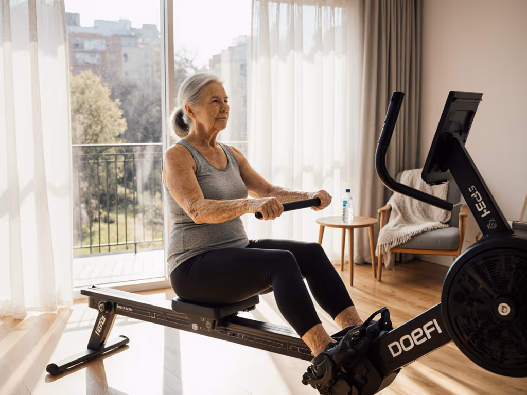
Rowing for Seniors With Balance: Safe Modifications
31st Mar•10 min read
Training, Technique & Benefits
Rowing Rehabilitation Protocols: Knee and Hip Recovery
23rd Mar•9 min read